ElLoco
Well-known member
- Messages
- 3,413
- Points
- 113
because it's scary who's sneaking up on you, even if it's not a monster.For some reason, 90% of all Western gay AVNs have horror as one of their main tags. I never found the reason for that.
Legitbecause it's scary who's sneaking up on you, even if it's not a monster.


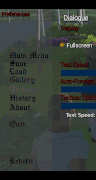
I probably didn't explain it well.Its meant to be dark, and it took me forever to get that to even be somewhat visible on mobile...if you mean the text on the left side when you pause, those are actually images--and we designed alot around keeping them there. I've done all i'm doing for the text...theres really no more space for options and its actually becoming so overkill nobody will even want to deal with them...if people can't see it with lighter text even on mobile and like six different fonts, they need to see an eye doctor not a programmer.
Any contrasting outlines on the actual options screens makes it look horrible (might as well use high contrast text, which is an option), I honestly regret even adding outline color to the options at all because its terribly drawn except for black or white.
If you can come up with a better color scheme using the font color options in HTML color codes that fits a horror themed game and makes it easier to see, i'll be more than happy to consider a swap...but the main problem is if it looks good on Desktop it usually cant be seen on mobile. I honestly gave up on the concept entirely because it has the translucent background. The only way to make the text look right on both would be images, and i'm terrible in any form of art program...I actually made the main menu ones using an old visual basic program I had lying around by modifying it
You now literally have every possible method to modify the text that I would have at my disposal yourself...if you feel like tweaking colors for an hour in the text / background color options, outline thickness and direction etc etc and come up with a good horror theme font and/or background color, not only will I consider using it but i'd be grateful for it. I dont have that kind of patience.
If users ended up interested in doing this I'd just let them create their own theme files at this point
EDIT:
The main problem vic...being real, is that when you pause the menu overlays whatever scene your at in the game--its absolutely impossible to tell which type of background its going to have. I HAVE considered adding a black image to the options screen so you can't see the game when you pause...but really thats about the only thing I can see being any help.


 , 5 Fragments Unlocked, and it will be shown in the "My Fragments" section of the My Rewards page, and can be found in My Profile -> Artifacts Showroom -> Select Artifact -> Upgrade -> Fragment Balance.
 , Congratulations and Good Job Everyone!
Yeah, me too...
He missed the "i will murder you in your sleep"
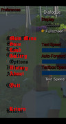
Its supposed to, unless you mean it has extra spaces compared to the extra spaces on say the minimized audio option? Click background audio, or for an easier idea of why its off to the side--turn the walkthrough offAlso a small remark about the menu: one item fell off a little to the side, or starts with extra spaces.
and it will disappear entitely, its a sub option of the walkthroigh option and can't be used without it, therefore its intentionally shifted over.Yeah, me too...

AWA Daily Quest for today (7 ARP): Collect & Win! - Day 1 - Match it! Space
Just click on the quest itself in the Daily Quest section and Match the pairs before the timer expires to get the ARP.
https://na.alienwarearena.com/quests/5498
For me, This week's theme, is Space Ship theme.
New Steam Quests Update: https://na.alienwarearena.com/steam/quests
Plants vs. Zombies Garden Warfare 2: Deluxe Edition (Not Free): Play for 1 hour to get 25 ARP
Marvel Rivals (Free): Play for 1 hour to get 25 ARP
Choose Your Own Game (Free): Select a game from your library and Play for 1 hour to get 15 ARP
SMITE 2 Community Event on AWA: https://na.alienwarearena.com/steam/community-event/smite-2-community-event
70000 of 70000 hour(s)
Milestone 9, The Last one Done
My Rewards
Community Event finished with 2 days+ to spare
SMITE 2 Community Event will not expire till Feb 12th, and you can still get your Personal hours in and get the Rewards.

Must be gettong older than me if you need the help
Again, the menu items are png files, copied from a visual basic form (as a print screen screenshot), dunped into windows paint, and manually adjisted by pixel space...then transferred to gimp because its basic cut and paste commands are total shit just to make transparent, usually 3 or 4 times (which was why I liked them so much compared to generic text--because they become transparent)Additionally, pay attention (it's not fatal, but!) for some reason the vertical distance between the menu items is different, and it may seem that the selected item is additionally highlighted, but this is not the case. I moved the new (with exact line spacing) text a little to the right and recolored it in red to make it visually
I actually kept going back and forth trying to find a balance of a good dark red on the background (and believe me 9 backgrounds on mobile later--even including a bright yellow one nothing works, its like mobile just murders the entire view due to transparency that likely shouldn't exist.It was just my opinion, so everything is absolutely normal, if my message remains without reaction, it's ok. No puns, no jokes.I would first rather redesign the entire background, sliders, everything to contrast to the text...which is a more likely possibility
Fox TV Stations: Anvato Player Frame
Again, this is a mobile issue...one which we designed the lightning around because those images are static...can't be remade, I wouldnt even know where to start at this point to get them right, nevermind to add the coloring your talking about. And that would take me much longer than a code change to say the preference text...as you said its your opinion, but even if I did it, then someone would have a different one and say they had issues seeing a certain color against another color or something because it's just them. I do get your point...but until/unless I get more feedback about the menu being a major issue...this one I just choose to ignore. It is our game and it is my design, and I like itIt was just my opinion, so everything is absolutely normal, if my message remains without reaction, it's ok. No puns, no jokes.
But the question is not at all in "ugly bright red", for some reason you don't want to hear the main idea of the message: dark text should have a light outline, light text should have a dark outline, so it works then on *any* background, the text color itself is chosen for example, no normal person makes (massive amounts of) bright red text, because it tires the eyes as a result.
In your case, dark text with a dark outline creates a single dark "spot", and to make it better visible, you need to make a light background. which does not really fit the mood of the game.
For another example, if you stop at the start screen, then the menu items will be clearly visible only when lightning strikes, that is, the background is as light as possible.

