WhatNitrous
Well-known member
- Messages
- 23,483
- Points
- 113
I'm seeing tentacles just thinking about itDo not press "big and slimy"....you will never be the same, Leia still has nightmares with it.
I'm seeing tentacles just thinking about itDo not press "big and slimy"....you will never be the same, Leia still has nightmares with it.
Ignorants will be ignorants.
Thank you...I love pong, and I have been thinking of an old retro arcade game to add as a mini game in our VN, that wouldnt require me stealing copyrighted graphics.Ignorants will be ignorants.
Either he is lying because he knows it's not true, or just wants to sell the concept for non-gamers to watch the show.
Besides, it shouldn't be Super Mario Bros to The Last Of Us, the guy speaks about "insert another quarter", it should be Pong to The Last Of Us.
Lol the last of us isn't even as revolutionary as games before it like doom super mario 64 gta 3 half life 1 and 2 and even street fighter and RE,most of these have complex mechanics that the last of us can't compare him saying that could mean that it's the only game he ever playedIgnorants will be ignorants.
Either he is lying because he knows it's not true, or just wants to sell the concept for non-gamers to watch the show.
Besides, it shouldn't be Super Mario Bros to The Last Of Us, the guy speaks about "insert another quarter", it should be Pong to The Last Of Us.
I was going to ask if the game is a demo or already the full thing, but since you are going to add stuff, it answered itselfThank you...I love pong, and I have been thinking of an old retro arcade game to add as a mini game in our VN, that wouldnt require me stealing copyrighted graphics.
Pong it is. (well one of them at least)
I would add pac-man to that list...the first real first quarter muncher (and another idea I been thinking about)
Breakout would be cool as well or something like galagaThank you...I love pong, and I have been thinking of an old retro arcade game to add as a mini game in our VN, that wouldnt require me stealing copyrighted graphics.
Pong it is. (well one of them at least)
I would add pac-man to that list...the first real first quarter muncher (and another idea I been thinking about)
No its just a short preview...start of the first episode, nobody on earth without a full blown corporation behind them could push out enough renders for a full game in a few monthsI was going to ask if the game is a demo or already the full thing, but since you are going to add stuff, it answered itself
I thought of galaga, but recreating all the enemies without stealing the visuals would be massive...copyright BS kills making direct imitations so I actually have to make all the sprites unique myself on top of code the gameplay.Breakout would be cool as well or something like galaga
Its because most people did it yesterday, mine doesn't existSo, since Legolas has forgotten, today's AWA quest is a secret world.
Let me help you:
"Non-existent type of politician in today's world."
"Papa Smurf on steroids."
I didn't have 2 quests yesterday. I guess it was one task only for us from shitty countries.Its because most people did it yesterday, mine doesn't exist
Well.What we really need is people to actually play it for the whole half hour to an hour it takes and review it (legitimately) on itch.io or join boosty or patreon as free members (but patreon is under review at the moment) We're all for criticism if anyone finds a reason to bring up issues...but we need real reviews from people who actually play it.
Not getting anywhere with 'oh it was good' as much as we appreciate the support.
Even bad publicity is better than no publicity. If the demo wasnt free I would have made free itch keys for access to the full version...I may in the future.
Slight flaw in my plan for publicity when we made it permanently free on itch.io




Well, it is the 1980s as much as it could be the 1970s or 1990s or even 2000s. Sorry, but I know what the 1980s looked like.Well.
Sorry I didn't have time to do this earlier, but I finally installed the Android version so I wouldn't be tied to one place, and played.
Let's get started.
View attachment 21478
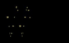
The first thing that confuses me is this whole thing at the beginning. It's too long, it's unclear, and it just takes up time. It ruins the first impression from the start, I came for the visual novel, not to stare at the flying letters for a whole minute, please don't bother, let me in. Maybe it should be shorter, maybe it should be in the About tab?
Main menu. Is there really any point in leaving this text as it is? You understand what it says, right? (Nothing bad, but who is it intended for?)
View attachment 21481
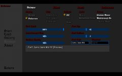
Next I go to settings. Hm.
View attachment 21479
Hmm.
Not the worst decision in the world, but Comic Sans has long been and deservedly been an example of a bad font. Just saying. Gothic fonts are also not the best idea, they do not fit into the general atmosphere of what is happening.
Okay, let's go to the game itself.
View attachment 21482
Oh, hi CriCri!
View attachment 21484
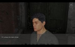
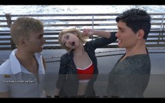
This scene is really, really not OK. I would highly recommend reworking it.

The reference to 1985 is also not very clear, it doesn't look like it at all, neither in locations nor in clothes, and those giant arrows in front of the eyes are very wrong. Perhaps it would make sense to move the events to the early 2000s, in the last days before the mobile era, then it would raise fewer questions from those follow the story.
View attachment 21485
Oh, look, he managed to do it before elon!
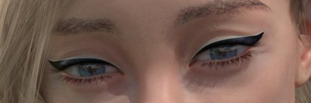
I know this is a really stupid comment, but damn, this animation really distracts me. It feels like as soon as the lady closes her eyes, a hole opens in her head:

View attachment 21487
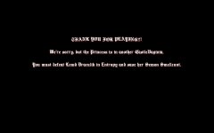
There are also a lot of questions about everything that happens after the ending. There's a lot of it, it's completely unnecessary, it's unskippable, and it's usually not funny at all, and it literally looks like it's almost repeating itself three times. Plus, the game has a really decent plot, so it just starts to spoil the experience after the ending. Even if you leave all that out, it needs to be made skippable.

And I also didn't like the gallery. Unfortunately, it's just confusing at the moment. You click on one menu, go to a section, the buttons change, from them you can go to other sections, there the buttons change again... And yada-yada-yada... Maybe it makes sense to make all the subsections at the bottom at once, just highlight the one you're currently in with a frame or color.
I also noticed that when a new character appears in the game, they are presented to us in full image, perhaps it makes sense to also allocate a separate section of the gallery for these presentations, because we only have the first chapter, and there are already about a dozen characters presented there, and new chapters do not appear immediately, so a kind of character index would not be superfluous.
In general, all of the above are of course trifles that do not interfere, and I would be happy to wait for the continuation, this is really a story, the images do not just exist, they help move the plot forward, so there is some intrigue, so yes, it is interesting!
That's the secret, in the eighties there were other people too.Sorry, but I know what the 1980s looked like.
First off, let me thank you for the honest critique, and playing.Well.
Sorry I didn't have time to do this earlier, but I finally installed the Android version so I wouldn't be tied to one place, and played.
Let's get started.
It was originally defaulted to DejaVu Sans, being optional I wasnt very concerned...but if you were to turn up the outlines and font size, then mess with colors you would see the reason...it looks 3D and the best of all the fonts.View attachment 21478
The first thing that confuses me is this whole thing at the beginning. It's too long, it's unclear, and it just takes up time. It ruins the first impression from the start, I came for the visual novel, not to stare at the flying letters for a whole minute, please don't bother, let me in. Maybe it should be shorter, maybe it should be in the About tab?
Main menu. Is there really any point in leaving this text as it is? You understand what it says, right? (Nothing bad, but who is it intended for?)
View attachment 21481
Next I go to settings. Hm.
View attachment 21479
Hmm.
Not the worst decision in the world, but Comic Sans has long been and deservedly been an example of a bad font. Just saying. Gothic fonts are also not the best idea, they do not fit into the general atmosphere of what is happening.
If you knew the nightmare ivo went through to find even that hanging scene...you would understand its not being done againOkay, let's go to the game itself.
View attachment 21482
Oh, hi CriCri!
View attachment 21484
This scene is really, really not OK. I would highly recommend reworking it.

As for her arrows...they were noticed and reworked already. They actually look worse in another render where they seem detached.The reference to 1985 is also not very clear, it doesn't look like it at all, neither in locations nor in clothes, and those giant arrows in front of the eyes are very wrong. Perhaps it would make sense to move the events to the early 2000s, in the last days before the mobile era, then it would raise fewer questions from those follow the story.
View attachment 21485
Its designed for when names will actually be added there, a section for the patrons basically.Oh, look, he managed to do it before elon!
I know this is a really stupid comment, but damn, this animation really distracts me. It feels like as soon as the lady closes her eyes, a hole opens in her head:

View attachment 21487
There are also a lot of questions about everything that happens after the ending. There's a lot of it, it's completely unnecessary, it's unskippable, and it's usually not funny at all, and it literally looks like it's almost repeating itself three times. Plus, the game has a really decent plot, so it just starts to spoil the experience after the ending. Even if you leave all that out, it needs to be made skippable.
I actually intended to have a third button but we thought it would mesh into the other selections too much...I understand what your saying though and this is a change I will truly consider.
And I also didn't like the gallery. Unfortunately, it's just confusing at the moment. You click on one menu, go to a section, the buttons change, from them you can go to other sections, there the buttons change again... And yada-yada-yada... Maybe it makes sense to make all the subsections at the bottom at once, just highlight the one you're currently in with a frame or color.
I also noticed that when a new character appears in the game, they are presented to us in full image, perhaps it makes sense to also allocate a separate section of the gallery for these presentations, because we only have the first chapter, and there are already about a dozen characters presented there, and new chapters do not appear immediately, so a kind of character index would not be superfluous.[/spoiler]
Again, appreciate you really giving our game a run and taking the time for the thorough rundown. Aside from the ending, i'll see what I can do about fixing up my end of thingsIn general, all of the above are of course trifles that do not interfere, and I would be happy to wait for the continuation, this is really a story, the images do not just exist, they help move the plot forward, so there is some intrigue, so yes, it is interesting!
I made the animation in Photoshop, the question is about the "light" in the head, which looks like a hole. It seems that the girl doesn't have enough skin, and when part of it goes to the eyelids, there isn't enough for the crownBlinking is not animation
